I had the privilege to work on HiringUP Enterpise during my stay in Chile. It’s an ATS (Applicant Tracking System) with custom-made features. Among those features is a dedicated design for our client’s Landing Page. So I won’t write about the system itself, but rather the LP, what we found out about the current website of Ripley Peru, how we wanted to fix it and what are the general ideas behind the whole redesign.
Before the whole design
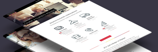
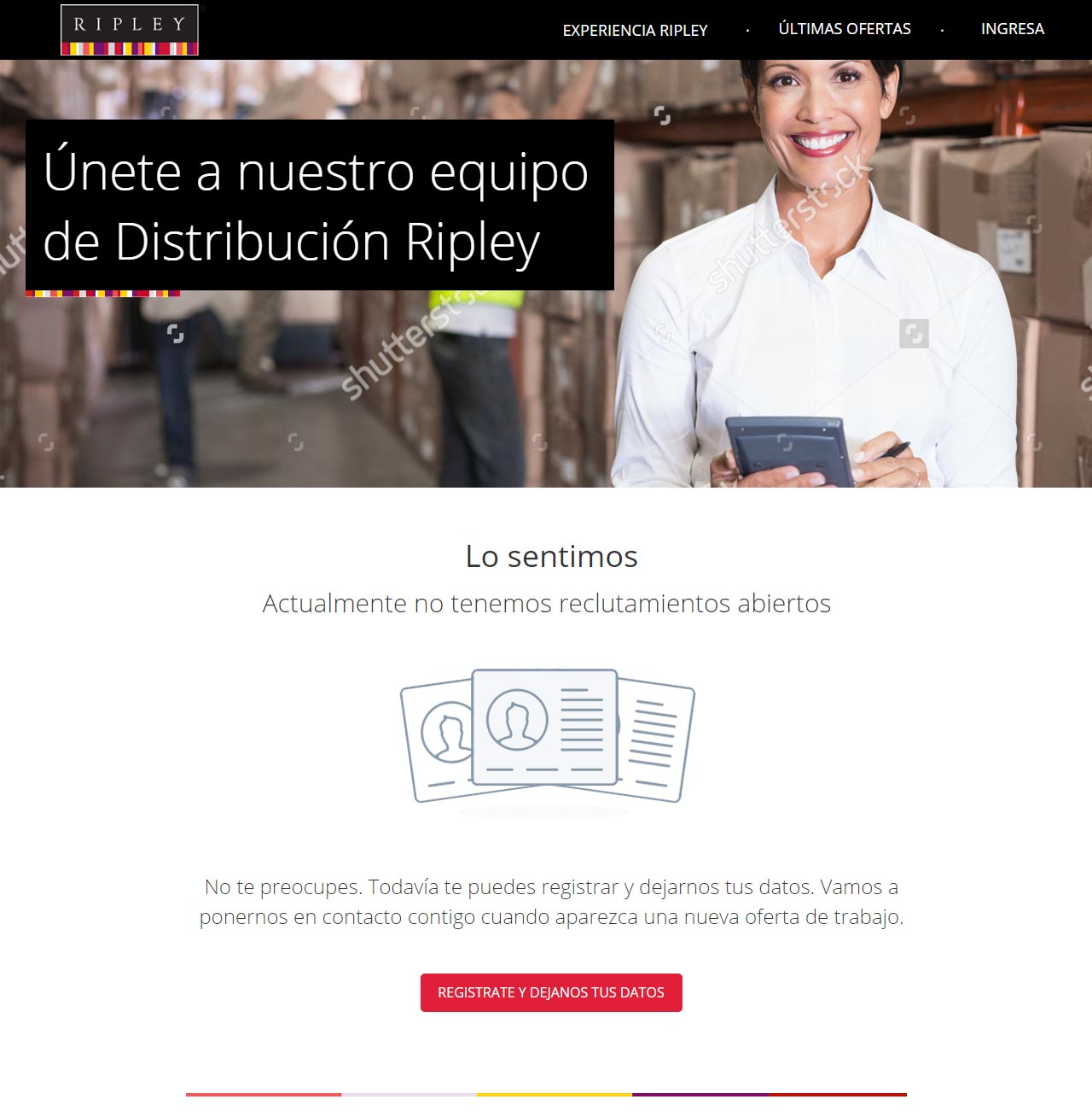
First things first. I decided to investigate what Ripley has so far. If it works and why not. And they have this page:
As you can judge by the URL it’s not a website hosted in their domain, but in an external service. We tested this website with users and it turned out they had several problems:
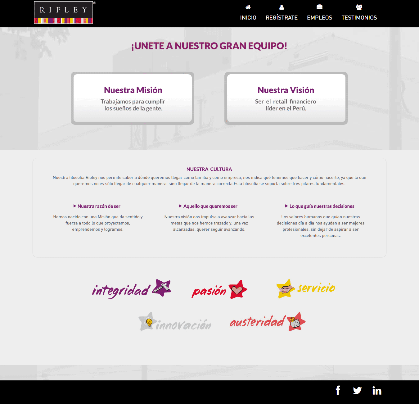
- “Nuestra Misión” and “Nuestra Visión” are looking as buttons, therefore misleading people, many users were stuck here. In general testers had problems navigating through the website
- Finding job offers and applying wasn’t that complicated, but later modifying data in one’s profile proved almost impossible (user has to leave the website and go to the main page of https://www.laborum.pe/ which was a difficult concept for non tech-savvy users)
- Ripley suffered from a small PR crisis few years ago, that’s why our testers mentioned multiple times they would have doubts applying there
- Another problem that surfaced was user retention. As one tester commented:
“If I don’t find an interesting job here, I’ll just go and look on Falabella’s (website)”
- Aesthetics

First sketches and ideas
At the beginning decided to order a little bit the website.
The main page would still highlight informations about the company, like its mission or vision, but on the front we also show the newest jobs offers that have been added recently. During our interviews with users, it turned out they already have some data about the company (that’s why they entered in the first place) and job openings is the content they are interested the most.
The idea was also to separate the job openings into categories (since they are a big company hiring for different departments) which should be visually distinctive and in case there are no interesting offers: to leave an option to sign up and set an alert. This way we would populate the client’s database with valuable data of potential employees.
Finally there should be another section which promotes working at Ripley Peru. When we suggested this idea to the client, it turned out they already started a similar program called Ripley Habla Positivo. This turned out to be a great source of content.
Actual design
Working with corporate clients has it merits. One of them is the fact that most of them already has style guides (pallete of colours, different options of logos, preferred dynamics of photos). This way I could prepare the high fidelity mock-ups quickly.
Knowing that there will be 6 categories:
- Banco Ripley
- Stores
- HQ / Corporative
- Call-Centre
- Distribution Centre
- Praxis for students
Each of the category would have a corresponding icon, highlighted job offer (if such exists) and link to other jobs in the section. Additionally each category would have its own header photo.
Below we would put information why it’s worth working for this company along with an invitation to read more about the subject.
In the first iteration the icon was a wallet with a dolar/sol sign. But after consulting it with the marketing department another idea sprouted: the most popular product in Banco Ripley is actually Tarjeta Ripley (which is a mix of a credit and loyalty card). This way we got a small personal touch in the design.
Categories, offers and photos
Since the current page is still hosted in Laborum’s domain and not much SEO is going on, we wanted to take care of it a little bit and provide description of each category.
And here’s an interesting titbit: our client liked the option #1, meanwhile testing with users showed that #5 is our winner.
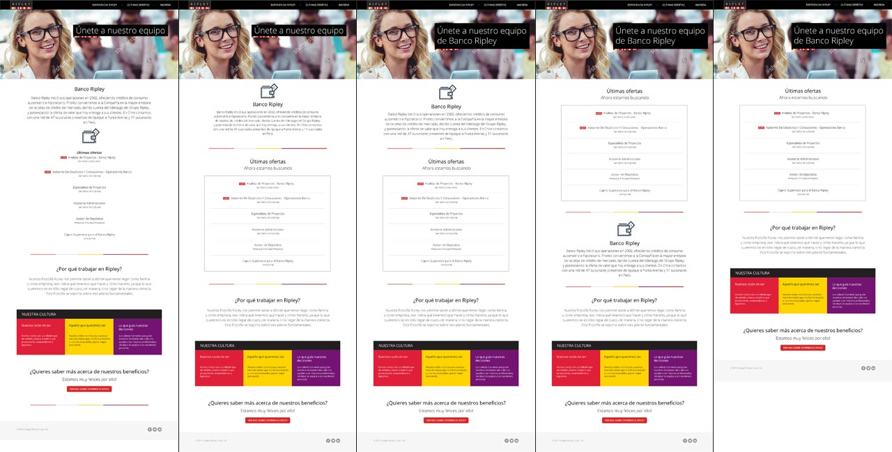
You see… most of users said that they don’t really care about description of the category at this point. They want to see the job offers right away. Therefore we decided to move this general description (of the category) to the job opening page. Also this way we might show more details about the team, direct boss or project in which the future employee would be involved in.
In case there were no openings available, the user is encouraged to register and save their preferences and interests. This way they could receive a notification when a new opening appears, meanwhile the HR manager has a database with candidates who are interested in this specific category.
And here we come to the single job offer page.
As in Poland the information about the quantity of vacancies in internet ads is usually equal to 1 or is simply not showed, in Latin America it’s almost obligatory to publish this data. That’s why we decided to put it below the name of the opening with added layer of transparent black colour (for increased visibility), this is followed by details of the publication and short summary of the team/direct boss (for the moment we left out information about the benefits and mission statement, due to the lack of content).
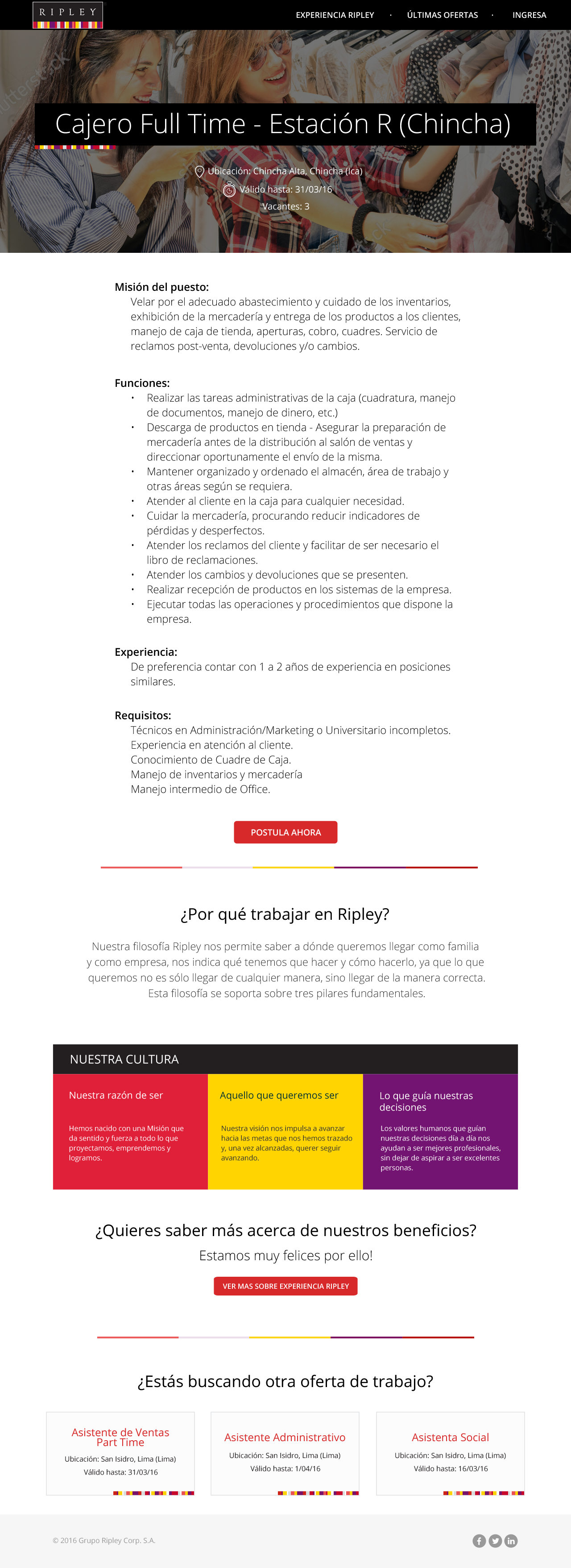
Finally we close the page with other similar job offers. This way we reduce the bounce or exit rates and gather information about correlations between each opening. Such data might be later used for scoring the candidates in the database and suggesting one that registered before, even for a different posting.
Problems
Argentina and Chile have significant numbers of immigrants from Italy, Germany or Croatia and from all over Latin America. For them there would be no problem using regular stock photos as presented in the mock-up.
However Peru is more sensitive about this subject, so a blond girl on the header photo is a no-no. Unfortunately we had no time and resources to do a proper photo-shoot (though a trip to Lima would be wonderful ![]() ), so we ended up with a huge dilemma.
), so we ended up with a huge dilemma.
Unfortunately, I was leaving the country at that moment, so I have no idea what was the final decision.
Another problem was the firewall in Ripley’s office. For some reasons no matter where I hosted the mock-ups (Dropbox or my personal server) the HR department wasn’t able to access it. And since they weren’t anywhere nearby for us to drop by and present the mock-ups, this proved to a little bit tricky.
At first we just generated the websites into PDFs and attached those in the mails. This was good when we were only showing progress and asked the marketing department if it goes along with their policy. But when it came to click&feel this wouldn’t do at all.
In the end we had to use a brute-force solution. I exported all the views as images and created multiple <area> in HTML. That into zip file and again sent via e-mail. It wasn’t the prettiest solution, but hey… it worked.
Final thoughts
Test!
Always.
Even if it’s a guerilla testing in your company.
Though I have to admit that my ideal “fool-proof” testing involves people of age 50+ and usually those not speaking the language. People born into the new technologies are more willing to test and click around, meanwhile the generation of our parents and grandparents is scared that they “might break something.”
Also working with elderly you can check if your Information Architecture is good. If they can find the information they need without (bigger) problems, then you’re all good.
My last advice is that if you’re working with a corporate client, ask in advance who has the final vote in the matter or that such person is designated to your project. This is going to save you a lot of time and pointless CCs to everyone in the company.
I am aware that I barely scratched the surface, if you have any questions or want me to elaborate, please leave a comment below ![]()
—
Clickable mock-up is available here: https://cloudi.net/Ripley/preview/home.html