Let’s talk about sports. And to be more exact, let’s talk about Freeletics*.
In general I like their app very much. Some things might be fix, but who knows, maybe a new challenge will arise ![]()
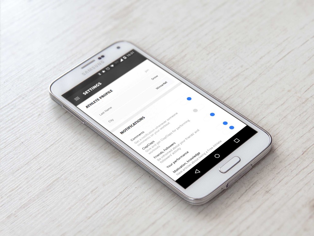
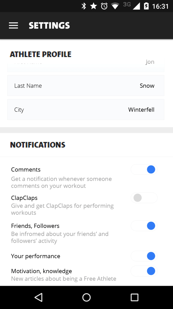
However I kind of lose track (pun not intended) in the Settings area. Why?
- The UI doesn’t exactly correspond to the rest of the app. It looks like they had no idea and left it like this or forgot to refresh it with an update.
- Each of the settings has a subsection. Technically it makes sense (division of settings by class/object), but on second thought it doesn’t have that many settings or fields to edit, not to try it leave it on one page. Also I don’t know what’s in each subsection. I have to go in, check, go back, check another one. Scroll is cheap nowadays. Readability is expensive.
- Also I don’t know why they have links to Nutrition Guide or Knowledge Center over here. This should rather be in a completely different section.
So in the end I designed it in a manner:
- Put everything on one page, completely kicking out the division for subsections.
- I’d also add descriptions of each setting (website has those for e-mail notifications only), because ’til this moment I have no idea what’s Your performance. The fact that I’m doing an exercise right now?
- Right now, in case of their notifications they have icons which might be filled with blue background (in case the setting is active or not). I have no idea why in the app those have phone icon (probably push notifications) and e-mails, meanwhile the website has only checkboxes. If the thing is not exclusive for specific device I’d keep it as checkbox and silder only. Because otherwise one indicates that I can choose a channel of communication.
Credits:
- Freeletics App available in Google Play and App Store
- Samsung mockup: http://blog.mobiversal.com/12-free-android-phone-mockups-samsung-galaxy-s5-htc-one-m8-and-nexus-5-psd-ai.html
* I think this app got me in better shape than any gym program I ever attended
—
Day 1: Sign up
Day 2: Credit card checkout
Day 3: Landing Page
Day 4: [skipped]
Day 5: App Icon
Day 6: User Profile