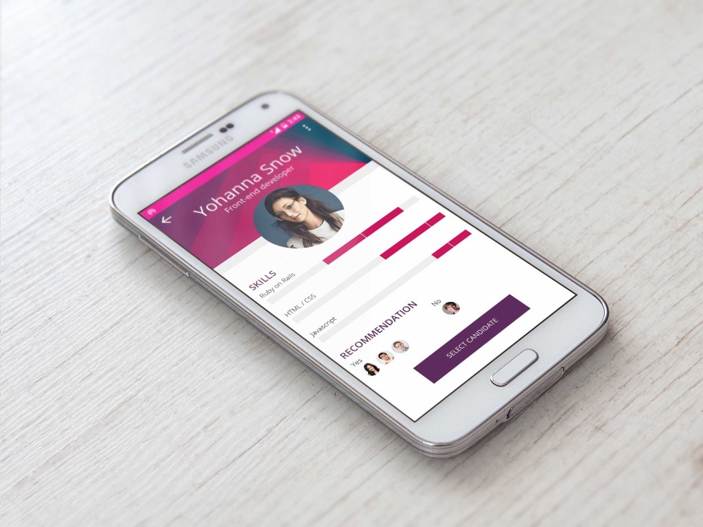
OK, this one is also far from perfect and done quickly, since my laptop decided to die on my in mid-work.
Now let’s cover the idea behind this one.
We come back again to the idea of app for recruiters:
- This profile is visible during the first or second screening (depending how the workflow of the company looks like). The idea is that we already have some information about the candidate and how they match our expectations towards the vacancy.
- Before we created “perfect candidate profile” where we can select which set of skills and range our candidates need to fulfil, so here we can quickly review if to allow the person to pass to the next step. This can be both automatic tests or comments of the recruitment specialists.
- The idea is also that tests and recommendations have more detailed view after clicking on demanded section, ie. amount of points, assessments, etc.
- This screen is not the final step/view in recruitment process. In that case we would rather need a matrix that allows us to compare all candidates that reach this specific point.

Credits:
- Profile photo: http://www.cosmopolitan.com.au/health-lifestyle/lifestyle/2013/10/create-a-killer-professional-pic/
- Samsung mockup: http://blog.mobiversal.com/12-free-android-phone-mockups-samsung-galaxy-s5-htc-one-m8-and-nexus-5-psd-ai.html
—
Day 1: Sign up
Day 2: Credit card checkout
Day 3: Landing Page
Day 4: [skipped]
Day 5: App Icon


