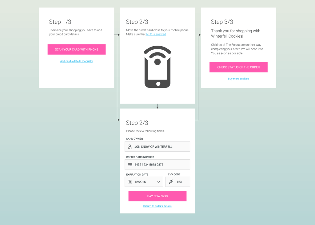
Credit card checkout today. For this assignment I’m going to assume a specific mindset:
- Since NFC cards got really popular in Poland (and are gaining more market share in Chile) in the last few years, this way of checkout is going to be the dominant one. With the help of NFC you can read basic informations from the card such as:
- Creditcard Number
- Firstname & Lastname
- Experation Date
- Transaction Counter
- Service Number
So everything you need (apart from the security code which still has to be filled out by the user).
However I’m still going to leave a fall back with manual entry. In such case instead of “review” on the 2nd screen there should be “fill out” - Security reasons. Banking operations, credit card especially, are those kind of things where user has to feel super safe. No matter how pretty the website is, if one feels that the transaction is not secure, one is going to drop.
- I’m assuming that the person doesn’t have a credit card in the system. If they would, then the main screen would be “choose or add new.”
Why to scan with NFC and not take a picture?
Security.
Imagine a situation when you take a photo, it automatically uploads to Dropbox (because you set it like that long time ago) and then someone hacks your account. If by any other chance there’s also a photo of the CVV code, you can kiss your money goodbye ![]()
Not covered in this design (but thought about):
- If the checkout is done on the desktop on the 2nd screen the user gets a QR code and a link which pairs the mobile phone for a short session (5 minutes). After scanning the card all the information is send to the form on desktop and the user has to only fill out the CVV code.
- Security/safety issues. If people learn that it’s easy to scan cards in general, they might not be so willing to use this form of checkout.
- NFC card/reader match. Readers in some phones might not be able to read the chips.
- Error handling.
Colour theme: http://colorhunt.co/c/9353
—
Day 1: Sign up


